Monday, October 17, 2011

I've Missed You!

It's been so long since my last post! Getting ready to move back to San Francisco, furnishing my new apartment, and now very demanding classes has had me super busy for the past couple months. So to make up for it I'll put some extra into this blog and put up the rest of the art from multiple days in my character design class. First is my homework from our week on animals. We had to pick one animal and draw various versions from realistic to anthropomorphic. Obviously I picked one of my favorite animals, a fox.


The next week we had to pick a movie that had not been animated and do a character line up of four characters (including the hero and villain of the movie), plus a turnaround of one of the characters. After much debate I finally chose the Mummy Returns. The characters I chose were of course Rick, Evelyn, Imhotep, and then my favorite character Anck Su Namun. She is just so sexay! So as a result she became my turn around.


The next week of class we had to pick a fable that had never been made into a movie. If we wanted we could use a story we had made up. Being that at the time I was in a group of three for my thesis and we were debating between two stories, I chose one of those as my “fable”. This was a story called Jeirra, about a world where people live on massive creatures, and traditionally cast out their children at the age of thirteen to find their own animal to live and grow with. We were to do a line up of at least four characters and a turn around of our favorite.


For the next few weeks we worked on the process of character design in a professional setting.We had to do a character profile, references, thumbnails, variations and turn arounds of our final character. So I chose the main character of my thesis group’s second story, Lantern. It was about a girl whose mother has died, and she is not able to let go. Eventually she winds up following her mother’s spirit into the Spirit world and so learns to come to terms with her mother’s death.Unfortunately a member of our thesis group backed out and we had to revaluate our stories due to the new lack of animators. As a result we have a brand new story that I will begin sharing with you soon.


Outside of class I try to participate in as much as I can. Last year I began doing visual development for a group animation. And again unfortunately, like many animations made outside of class, it too fell apart. But I sill have some fun character designs to show for it. And it involves a Yeti, which I flipping love.


Well that’s all I have for now! Sadly due to my heavy workload this semester there will be very little updates on this blog in the coming months. Hopefully I’ll be able to get in a few thesis updates soon!

Saturday, July 30, 2011

Emily Carroll Week


So for this week we got to pick an artist to emulate. So I chose Emily Carroll! I've loved and admired her work for a while now, and she is definitely up there on my favorite artists list. Her style is so different from my own and still carries some similarities at the same time so it felt like the perfect thing to try. It was so much fun, and I really learned a lot from her work!


Wednesday, July 20, 2011

Colin Jack Attack


So the assignment for week four of my Character Design class was to create 4 characters and 10 heads in the style of the amazingly talented artist Colin Jack. And for this week my teacher said to take a note from Colin Jack's artwork and have fun with your designs. I really tried to take this to heart and as a result I had so much fun I wound up with an excess of drawings! It was by far my favorite week of our assigned artist homework and it really had an impact on my artwork in the long run.


Friday, July 1, 2011

Heads Up!


Here is a collection of in class and assignment drawings I did during my head drawing class. I love doing portraiture and this class really helped me practice capturing a person's likeness. Sorry for the poor quality in pictures. I took them on my cell phone in class before they would smudge on the way home. The drawing above was my favorite in class drawing. We were talking about using different levels for the background to get our desired effect. I liked the drama vibe so I usually opted for a darker background.


This was my final. It's based off a fellow student in the class who had an awesome serious sailor vibe.


An in class project where we did a portrait alternating between three students. It turned out a lot better than I thought it would!

A thumb nail for testing out different background levels. I liked this one a lot.


Some drawings from earlier in the semester.

Our first time dealing with a darkened background.


Wednesday, June 29, 2011

Digital Painting Class

So last semester one of the classes I took was digital painting. Digital painting is something I know basically how to do, but I was very slow at it and only knew how to do it in the way that I had figured out myself. I wanted to learn more techniques that I had seen other people do. Unfortunately the class was only a three hour class instead of a 6 hour class and we had to learn a massive amount of information so it became very rushed. I'm not really completely happy with any of the finished products because I took too long experimenting with them. I kept trying to figure out the styles I wanted to learn based off of the information I was actually learning in class. A lot of my trouble came from a lack of color knowledge, but thankfully I am taking a color theory class next semester.


The first assignment we had was a landscape we painted in Corel. We were allowed to add a person into the painting if we wanted but the main focus had to be the landscape.


Our second assignment was also done in Corel and was the cover of a type of book we would like to illustrate. I chose a children's book since I would absolutely love to illustrate one in the future. I didn't have an original story in mind and I love the classic fairy tales so I chose a favorite of mine, Little Red Riding Hood. The only problem was we had to look up the standard size for our genre's cover. Children's books can be all kinds of sizes but the standard size was a very awkward square...


Our third assignment was a continuation of the book. We were to take a page from inside the book and illustrate it. I LOVED my original sketch but it didnt fit into the square page as well as I would have liked. For this assignment we could choose to do photoshop if we liked, but the technique I had used on my cover kind of required Corel so I stuck with it.


Our last assignment was to do whatever you want. I had seen a friend do a smooth painted scene for an animation and I wanted to do something similar to learn the technique. Unfortunatley my teacher didn't have the time to really sit and teach me the process so I took what I was doing in Corel and applied it to Photoshop. Thankfully while I was on break between Spring semester and summer school I had time to practice the style I wanted to learn in Photoshop. I haven't perfected it yet but I am a lot better than I had been so I'm pretty excited about it!

Stephen Silver Week

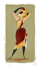
For week four of my character design class we focused on Stephen Silver. I remember being obsessed with the show Kim Possible when it came out on the Disney Channel so I was ecstatic to try out drawing like the show's awesome character designer. It was also a great excuse to watch some Kim Possibles as research. As far as my heads were concerned I was still trying to practice capturing someone's likeness. So this week I used the actors of 30 Rock as my reference. I still don't believe it's perfect but I was definitely excited by my progress. When it came to my figures I felt like having a theme for the week. I have a fondness for the old circus and I felt it could produce some great characters as well as some fun poses.


Monday, June 27, 2011

I AM NERD


In our third week we studied the all mighty Bruce Timm. I LOVED this week! Although I am not the biggest fan of super heros and such I did grow up watching Batman; the Animated Series after school on a regular basis. I remember loving the edge the cartoon had and the sexy pin up style the girls were drawn in (Poison Ivy and Harley Quinn being particular favorites of mine). Of course now the thing I gravitate towards drawing the most is girls, and I especially love drawing in pin up style so Bruce Timm was right up my ally.


We also had a lecture on race in our class that week, and how you had to make it readable right off the bat. At this point I had gotten the idea from a fellow classmate, who had done Dexter characters for his head drawings, to similarly do iconic show characters for my own heads. In my mind I wanted to be able to capture the character, and become stronger at drawing a likeness to a real person. So me, being the nerd that I am, decided to use Lost since it had such a racial diversity, is a well recognized cast, and well, I am a nerd. I was fairly pleased with how it came out. At first I wasn't sure it worked. And when I showed it to friends who didn't really know the show, it was less than encouraging to have to show them the reference pictures, and just lose the desired impact all together. But when I brought it to class without any kind of label on the paper or words from me, one by one my classmates started pointing out the characters. I don't think they are all total successes, but the fact that enough of them look right so that people could identify the show, and then narrow down who each person was, felt like a good step forward.